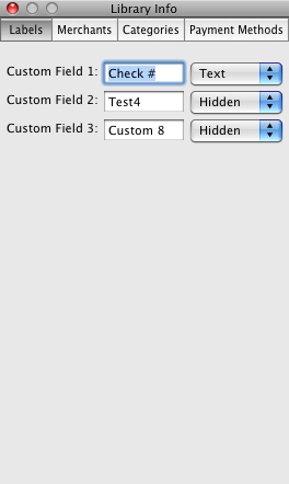
I’ve spent a significant amount of time working on the new version of ReceiptWallet. One of the changes is that information about a Library is now in a floating panel. However, I’m not happy with the buttons/look of the panel. I’m looking for ideas that people may have. Please feel free to post comments on send me email with ideas. Thanks!
Here’s what it looks like:
Hi Scott,
I’d suggest:
A) Change the popup buttons’ controlSize to small. Currently they’re large buttons with small text which just looks wrong.
B) For the tab bar across the top copy the style we have in Sandvox or iWork.
Thanks Mike! It only took me about an hour to figure out where IB 3 hid the controlSize for the popup button. For the tab bar, I was going to use a segmented control, but didn’t like the round edges. I see that Sandvox uses one, but you made the control wide enough so the rounded edges don’t show. Excellent!