The best, underutilized and poorly implemented accessibility feature
[Update - October 21, 2015: It looks like the issues with News have been fixed with the iOS 9.1 update. Yeah!]
iOS 7 brought a feature called dynamic type which moves away from developers specifying exact point sizes for text and instead uses a number of descriptions for fonts.
From UIFontDescriptor.h:
    // Font text styles, semantic descriptions of the intended use for a font returned by +[UIFont preferredFontForTextStyle:]
    UIKIT_EXTERN NSString *const UIFontTextStyleTitle1 NS_AVAILABLE_IOS(9_0);
    UIKIT_EXTERN NSString *const UIFontTextStyleTitle2 NS_AVAILABLE_IOS(9_0);
    UIKIT_EXTERN NSString *const UIFontTextStyleTitle3 NS_AVAILABLE_IOS(9_0);
    UIKIT_EXTERN NSString *const UIFontTextStyleHeadline NS_AVAILABLE_IOS(7_0);
    UIKIT_EXTERN NSString *const UIFontTextStyleSubheadline NS_AVAILABLE_IOS(7_0);
    UIKIT_EXTERN NSString *const UIFontTextStyleBody NS_AVAILABLE_IOS(7_0);
    UIKIT_EXTERN NSString *const UIFontTextStyleCallout NS_AVAILABLE_IOS(9_0);
    UIKIT_EXTERN NSString *const UIFontTextStyleFootnote NS_AVAILABLE_IOS(7_0);
    UIKIT_EXTERN NSString *const UIFontTextStyleCaption1 NS_AVAILABLE_IOS(7_0);
    UIKIT_EXTERN NSString *const UIFontTextStyleCaption2 NS_AVAILABLE_IOS(7_0);
When developers use these instead of say Helvetica Neue 12, a user can change the font size in Settings->Display & Brightness->Text Size.
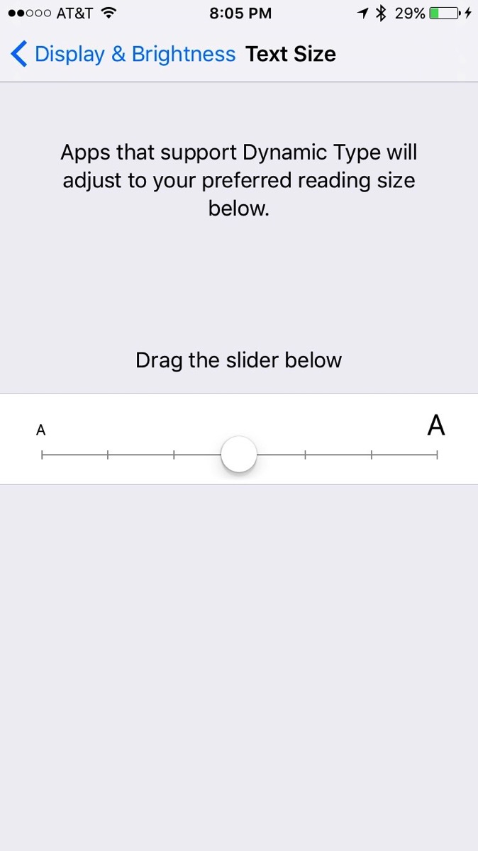
This is generally thought of as an accessibility feature as it helps people who have trouble seeing. However, for people like me who can see well with glasses, larger type is just more comfortable to read. Implementing this is quite easy, but requires a few extra steps like listening for changes to the fonts and making sure that table rows resize to accommodate the text. These steps aren't rocket science and don't take much effort, but many developers are constrained by what their designers give them and many designers are still used to specifying exact fonts as well as spacing. This needs to change as it is hurting those that want to increase the font size and also makes it harder to adapt to different screen sizes.
I've implemented dynamic type in a few of the apps I've done and it worked out well; the extra effort was worth it in my opinion. Some developers just don't care and other developers including Apple make an attempt, but fall short.
Here are images from the Apple News app. The first image is the standard text size; the second is the largest text size (largest before going into Accessibility and moving it to super large).
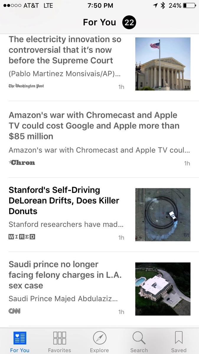

(I never knew there were images with the posts because they aren't seen with the large text.) You can see that the text resizes along with the cells, but the title collides with the first part of the article. That's pretty sloppy.
The next example is in Calendar. This one is worse than the first because the row is a fixed height and it looks like each row of text is also a fixed height so that when a larger font is used, it looks awful.
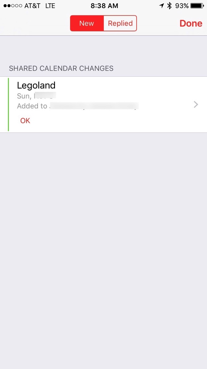
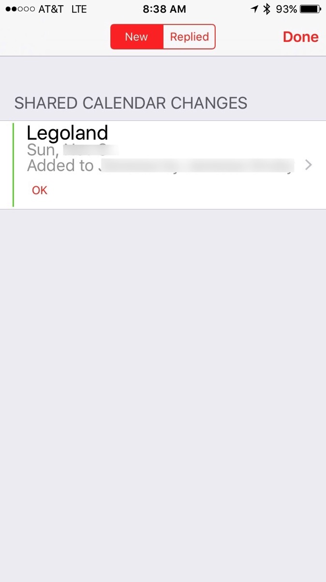
For a company that pays so much attention to accessibility, these examples show that individual teams making the apps aren't doing enough to look at their apps. Maybe all the engineers have great eyes and can see the text, but this does need to get fixed. (Filed as Apple Radar 23196322.)
Outside of Apple, developers need to pay more attention to this; accessibility is hard and I'll be the first to admit that I don't do enough on accessibility. Handling dynamic type is an easy first step in making apps more accessible and easier for everyone to use.