Auto Layout is an amazing concept for developing iOS apps as it allows for an application to more easily look good across different devices. In addition it makes using dynamic type so much easier; as someone that wears glasses I always increase the type size on my devices and when apps don’t take advantage of it, I get kind of annoyed. So when I develop apps, I try to use dynamic type and using auto layout makes things so much easier.
A common theme in apps I develop is to have a UITableView with a bunch of rows. The rows have different bits of text and the only sensible way to develop this is using auto layout. With the latest releases of iOS, a lot of code dealing with dynamic type, heights of cells, responding to device changes, etc. has been eliminated. However, there are still a few gotchas in making an app with a UITableView that behaves properly.
I’m going to go over the steps I used (and provide sample code) for how I handle this. I had a few requirements that make my implementation a little different than other tutorials on the web.
- Each cell has an image that would be at most 1/3 the width of the screen.
- The image must touch the top and bottom of the row.
- The image had to be at least a certain height.
- The image should attempt to have the aspect ratio of the original image. (Aspect Fit could leave white space; Aspect Fill could hide some of the image.)
- Images are loaded asynchronously from the Internet.
- Next to the image is up to 5 lines of text pinned to the top.
- Next to the image is 1 line of text pinned to the bottom.
- Each line of text could wrap to multiple lines.
- Increasing the type sized must resize the rows.
- The cell must have a minimum height.
- Rotating the device must work.
Writing that out sure looks more complicated than it was in my head!
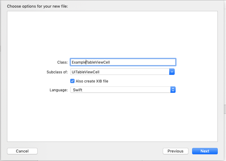
I’m not going to go over the initial project setup, but will jump right into Interface Builder after I created a UITableViewCell with xib. Note that I don’t use Storyboards and opt to create a separate xib for each view controller and each cell; Storyboards tend to bite me each time I use them as I like to re-use code as much as possible and by default the Storyboard for a UITableViewController puts the cell in the Storyboard making it harder to manage. I’m sure some would argue with me that Storyboards are great, but they just don’t work for me.
- Create a new UITableViewCell with a xib.

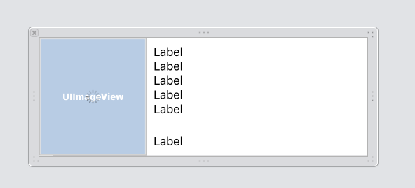
- In the xib, add a UIImageView to the left side that is pinned to the left, top, and bottom of the cell.
- Set the UIImageView to Aspect Fill and Clip to bounds.
- Give the UIImageView fixed width and height constraints. (We’ll change this later.)
- Add a vertical stack view pinned to 10 pixels from the UIImageView, pinned to 10 pixels from the top and 10 pixels from the right.
- Add 5 UILabels to the stack view. Each label should be set for “Automatically adjusts font” and a Font of Body. Set 1 or more of the labels to have 0 Lines so that it grows vertically. Also, set auto shrink to minimum font scale of 0.5.
- Add another vertical stack view pinned to the leading of the first stack view, 10 pixels from the right and bottom of the container and on the top to be >= 5 from the other stack view.
- Add a UILabel to this stack view. Set the font as above.
- Set the height constraint of the UIImageView to a priority of 250 (low).
- Add a UIActivityIndicator that is centered on the UIImageView (set the constraints).
- Create a UIImageView subclass that looks like this. The UIImageView uses the intrinsic size of the image in the absence of other constraints and we want more control of the height of the view.
class ExampleImageView: UIImageView { var minimumHeight: CGFloat = 0 override var intrinsicContentSize: CGSize { if minimumHeight == 0 { return super.intrinsicContentSize } return CGSize(width: 0, height: minimumHeight) } } - Change the UIImageView class to ExampleImageView.
- Connect outlets for the 6 UILabels, the UIImageView (with the new class), the activity indicator and the height and width constraints on the UIImageView.
Your xib should look like this:

Time to move into the source of the table view cell. I’m only going to cover the interesting parts here. See my example repo at for the full example.
- Setup a variable for the cell width. This is going to be set through the view controller so that rotation changes can change the width of the image.
var cellWidth: CGFloat = 0 { didSet { maxImageWidth = cellWidth / 3 setImageWidth() } } fileprivate var maxImageWidth: CGFloat = 120 - Add a method for setting the image width.
fileprivate func setImageWidth() { if let image = cellImageView.image { let scale = image.size.height / contentView.frame.size.height var newWidth = image.size.width / scale if newWidth > maxImageWidth { newWidth = maxImageWidth } contentView.layoutIfNeeded() let animator = UIViewPropertyAnimator.init(duration: 0.1, curve: .easeOut) {[weak self] in guard let self = self else {return} self.cellImageViewWidthLayoutConstraint.constant = newWidth self.contentView.layoutIfNeeded() } animator.startAnimation() } } - Next in the view controller, add the following to handle the change in width of the cell.
override func willTransition(to newCollection: UITraitCollection, with coordinator: UIViewControllerTransitionCoordinator) {
    if let visibleCells = tableView.visibleCells as? [ExampleTableViewCell] {
        for cell in visibleCells {
            cell.cellWidth = tableView.frame.width
        }
    }
    super.willTransition(to: newCollection, with: coordinator)
}
Believe it or not, I think that’s it! I’ve spent at least 4 weeks on this issue and keep running into some problem. Rotation and changing font sizes (Accessibility Inspector is great for testing) kept bringing up issues.
The example repo can be found here: https://github.com/sgruby/TableViewExample.
Feedback/changes are welcome! I’m sure I’m not doing something correct or there is an easier way; I just haven’t figured it out, yet.