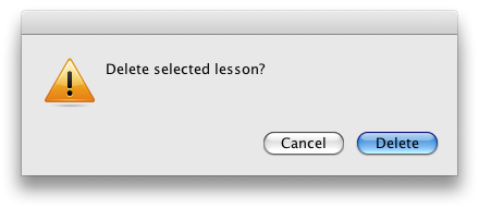
On Friday I stumbled across ScreenSteps, a program for doing documentation by quickly and easily capturing screen shots. While I no longer do documentation for my own software, I am starting to do some internal documentation for work on things like connecting to our VPN, setting up connecting to a file server, etc. I put together one “lesson” in maybe 15 minutes and was able to stick it on our internal web site. One thing that bothered me was that there were some dialogs that didn’t look like Mac dialogs like the following (The icon looks funny and it should have been a sheet):

Things like this usually indicate it was written in REALbasic. While I don’t have anything against REALbasic itself, I have problems with people slapping together programs in REALbasic and passing them off as Mac applications; in most cases they work like Mac applications, but they seem unpolished. I realize that this is a generalization, but I haven’t seem a REALBasic based program that I’d purchase (at least knowingly). ScreenSteps didn’t have the REALbasic libraries buried in its app bundle, so I knew it wasn’t built using REALbasic. So did the developers purposely create crappy looking buttons? I don’t think so. They appear to release the Mac and Windows versions at the same time, so they must be using some type of cross platform library. Ah, the about box gives me a clue. They’re using a system called Runtime Revolution. Uggh, another attempt at creating cross platform applications with the click of a button.
So the question boils down to, can I live with the sort of Mac like appearance to quickly build documentation or can I find another tool? I’m not sure, but I’m definitely not a fan of cross platform tools as they produce apps that just aren’t up to Mac UI guidelines.