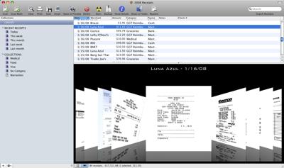
In order to add some “bling” to ReceiptWallet, I used Apple’s CovertFlow example code to create a CoverFlow like view in ReceiptWallet. At this point, I’m not sure how useful it is, but it sure looks cool!
It’s in the latest beta of ReceiptWallet (and DocumentWallet), so go ahead and grab it and let me know what think!

Does it work like in iTunes, like when you click on an item in the top list, will it scroll thru them on the bottom to the one selected?
Also, just a suggestion Scott,
Since you are dealing with receipts, wouldn’t it be cool to have an area for those receipts with like the online or phone survey at the bottom, and then like a check box to show you have completed that survey.
Yes, if you select an item at the top, it scrolls through on the bottom. I still want to add a horizontal scrollbar on the bottom.
I’m not sure I understand the suggestion. There are 3 custom fields that users could use for this, i.e. “Survey completed” and then put a mark in that field. Or better yet, survey not completed and then the user can find all those that have a mark in that field.
Ah, ok. Forgot about the custom fields, that solves it. When and if I get a Mac (or if an emulator comes out for Windows), this is some software I would buy.