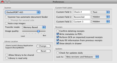
Another part of my UI overhaul is to redo my preferences. They’ve completely gotten out of hand and everything has been in one window like this.

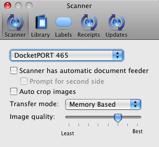
I like how iTunes and other apps (including the Finder) have a tabbed toolbar interface, so I went that route. Using Matt Gemmell’s SS_PrefsController as a base, I re-worked my preferences into different panes. The source uses plugins for the preferences which I don’t need, so I modified the code to embed everything. I’m waiting to hear back from my icon guy, but things are looking better. Ignore my icons for now.

Wow, what a huge difference a few tweaks can make to a program. I also turned on autohiding of the scrollbars. Due to some bugs in the OS, I had to do some magic to get things drawing correctly. Having a blank toolbar looks bad, but I didn’t want to deal with it before.
I wish I had one of those receipt thingymabobbers. Someday when I am rich I will buy on of those… and DVR…. and a pack of dogs.